様々な課題解決事例・制作実績を掲載しています。
業界や商材が異なっても構造が近いケースは多くあります。
「自社の場合、どのように解決できるか聞きたい」
「予算内でどんなことができるか知りたい」
という方はお気軽にお問い合わせください。
貴社サイトの状況や課題感にあわせて近い成功例や改善の方向性をご案内します。
外資系コスメブランド公式ECサイトUI/UX改善プロジェクト
実店舗・モールと公式ECの最適な役割分担とは

Client
ELCジャパン合同会社(エスティローダーグループ)は、「エスティローダー」「MAC」「ドゥ・ラ・メール」「クリニーク」など、合計10のプレステージビューティブランドを日本で展開する企業です。スキンケアやメークアップ製品を取り扱い、有名百貨店を中心とした実店舗での販売や、各ブランドの公式ECサイトを運営しています。あわせて、女性の活躍推進や乳がんキャンペーンといった社会貢献活動にも積極的に取り組む会社です。
----------------------------------------------------
ELC Japan G.K. (the Estée Lauder Companies) markets a total of 10 prestige beauty brands in Japan, including Estée Lauder, M·A·C, La Mer, and CLINIQUE. Handling skincare and makeup products, it sells through physical stores—primarily in leading department stores—and operates an official EC site for each brand. The company is also an active contributor to social causes such as advancing women's empowerment and breast cancer awareness campaigns.
Result
UI/UX改善による公式ECの役割明確化とEC化率の目標設定および各公式ECサイトのコンバージョン率改善に向けた具体的な戦略策定を実現しました。
—————————————————-
Through UI/UX improvement, we clarified the role of the official EC channel, set EC penetration targets, and built a concrete strategy for raising the conversion rate of each brand’s official EC site.
Solution
Overview
大手コスメブランドの公式ECサイトのUI/UX改善を目的とした本プロジェクトは、日本におけるブランド公式サイトの位置づけを再定義するという重要なミッションからスタートしました。
百貨店を中心とするプレステージブランドとして、EC化率の目標値をどの程度に設定すべきか、さらにはAmazonや楽天といった巨大モール、そして実店舗と公式ECの間で、どのように役割や発信コンテンツを棲み分けるべきかという課題が存在していました。
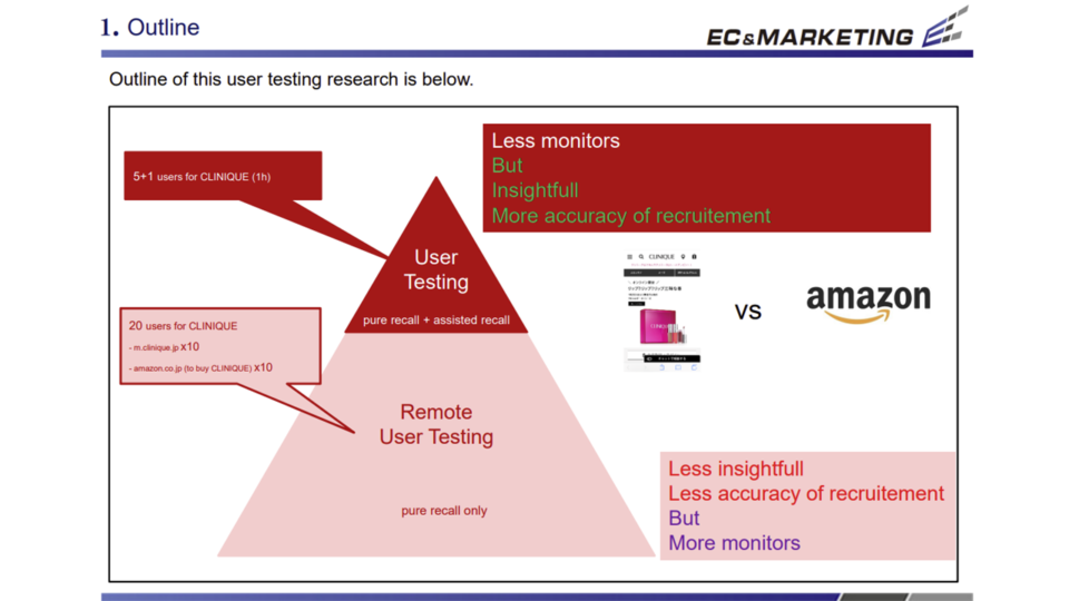
これらの調査結果を香港の事業責任者へ的確に報告するため、以前からUI/UXの知見と確かな実績を評価されていた株式会社ECマーケティングへ依頼が寄せられ、プロジェクトが本格始動しました。調査は2期に分けて進行し、第1期では「エスティローダー」「MACコスメティックス」「ラ・メール」の3ブランドを対象とした競合ベンチマーク評価、および「エスティローダー」「MACコスメティックス」の被験者テストを実施しました。
続く第2期では、「クリニーク」の公式ECとAmazonの比較調査を行っています。日本独自の市場環境を踏まえた戦略的かつ有益な示唆が多く得られたプロジェクトと言えます。
★★★同様の課題に関する意見を聞きたい
—————————————————-
This project—aimed at improving the UI/UX of a major beauty group’s official EC sites—began with a critical mission: to redefine the role of the brands’ official sites in the Japanese market. As prestige brands centered on department-store sales, they faced key questions: what EC-penetration target was appropriate, and how should roles and content be divided among giant marketplaces like Amazon and Rakuten, physical stores, and the official EC sites?
To report the findings accurately to the regional director in Hong Kong, the group turned to EC Marketing—long recognized for its UI/UX expertise and proven track record—and the project formally launched. The research ran in two phases. Phase 1 comprised competitive benchmarking of three brands (Estée Lauder, M·A·C Cosmetics, and La Mer) and user testing of Estée Lauder and M·A·C Cosmetics. Phase 2 then compared CLINIQUE’s official EC site against Amazon. It was a project that yielded a wealth of strategic, actionable insight grounded in the unique conditions of the Japanese market.
Process
Point.01
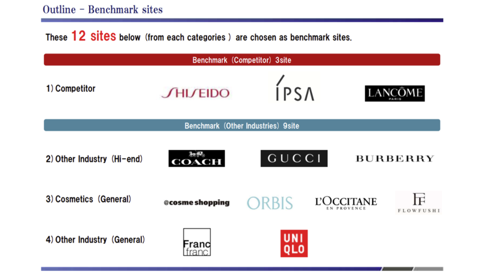
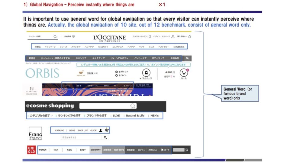
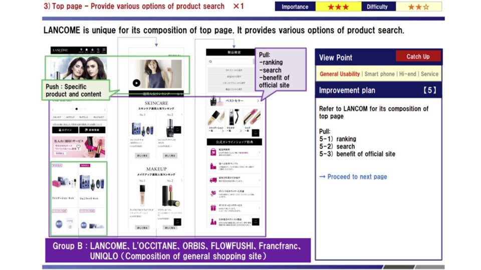
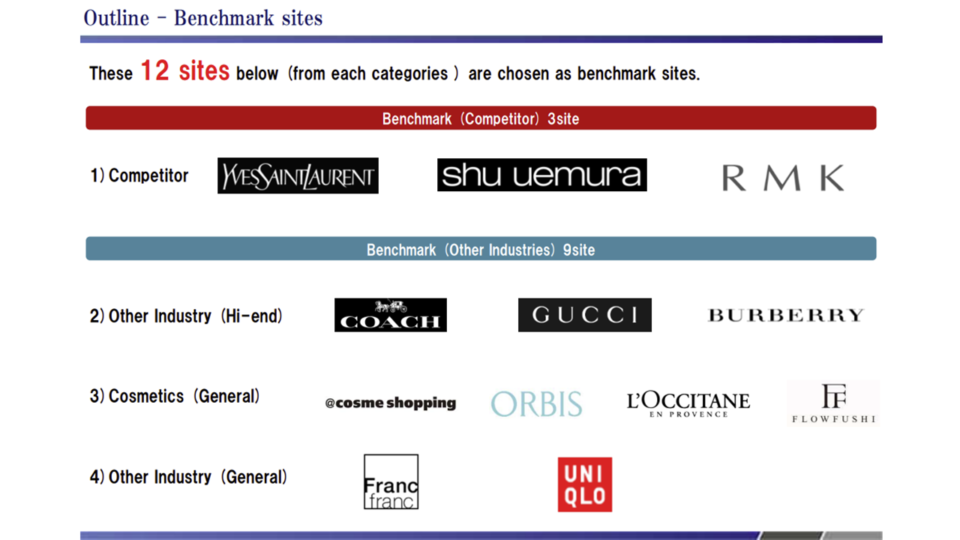
エスティローダーの公式オンラインショップを対象に行われた競合ベンチマーク評価では、資生堂、IPSA、LANCOMEといった主要な競合他社サイトに加え、他業界の優れたECサイトを含む合計12サイトとの緻密な比較検証が行われました。
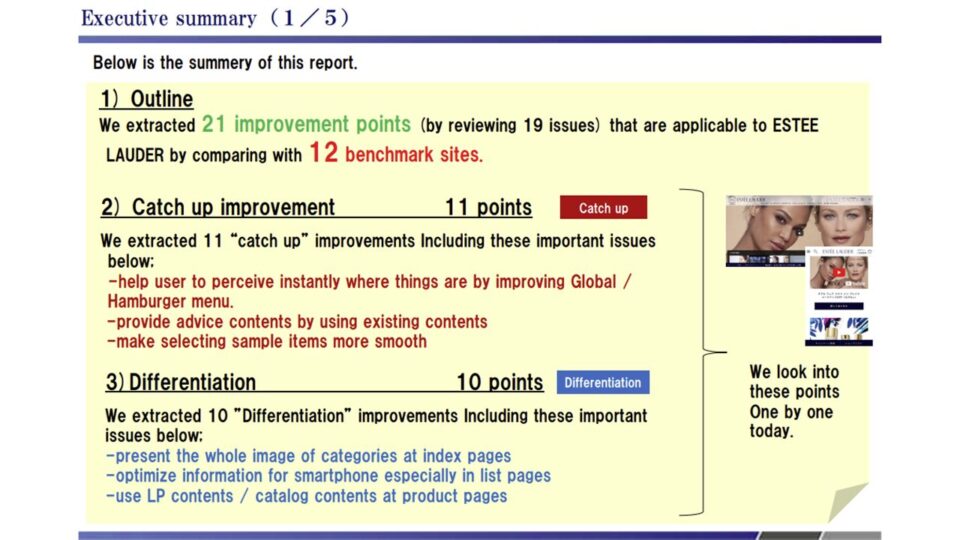
その結果、エスティローダーのサイトには、直ちに他社水準に追いつくべき「Catchup」項目が11点、独自性を高めるための「Differentiation」項目が10点、合計21の改善すべき課題が浮き彫りになっています。
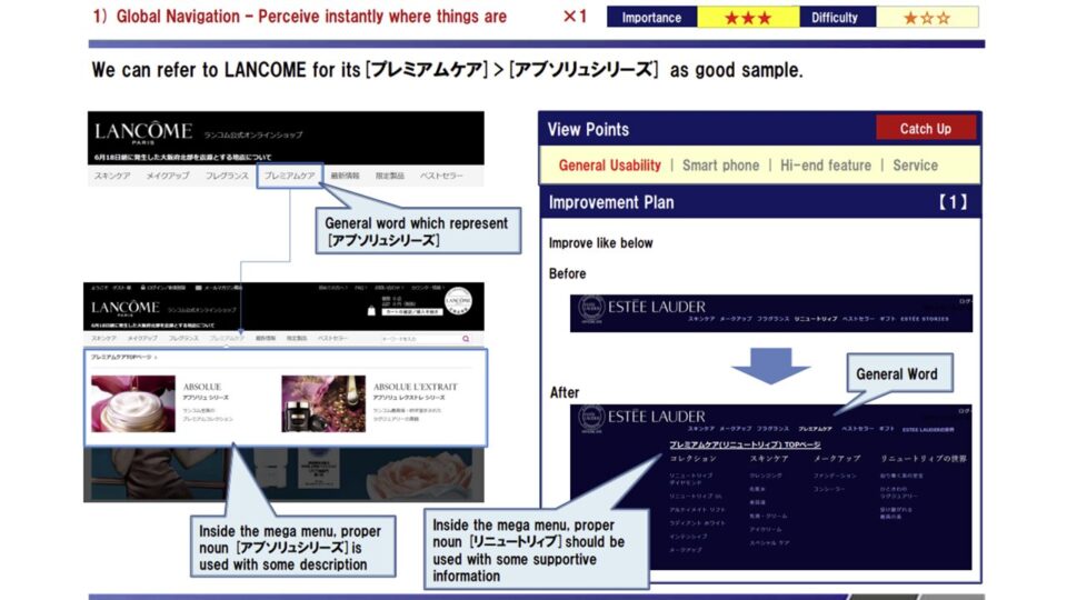
評価の過程で明らかになったのは、ユーザーが求める情報へのアクセスのしやすさに関する課題です。
多くの競合サイトがスキンケアなどの大カテゴリーに対して見やすいインデックスページを設けているのに対し、エスティローダーではカテゴリー構成や商品ページの情報の充実度に改善の余地があることが判明しました。
特に、商品の成分や使用方法といった、ユーザーが購入を決断するために必要不可欠な詳細情報の見せ方が不足していると考えられます。
ユーザーの購買体験に直結するチェックアウトプロセスの検証では、サンプル選択画面の操作性に難があることが指摘されました。具体的には、画面を下にスクロールしないと「次に進む」ボタンが現れない仕様になっており、これがスムーズな購買行動を阻害する要因となっています。加えて、顧客のロイヤリティを高めるためのマイページがやや無機質なデザインに留まっており、競合他社が積極的に導入している実店舗と連動したポイントプログラムなどのサービスが存在しない点も、公式ECとしての魅力向上に向けた大きな改善ポイントとして挙げられました。
これらの課題を一つひとつクリアすることで、ユーザーにとってより魅力的で使い勝手の良いサイトへと進化するはずです。
■印象的な課題例
・スキンケア等の大カテゴリーのインデックスや、成分・使用方法などの商品説明の拡充が必要。
・サンプル選択画面でスクロールしないと次へ進めず、チェックアウト時の操作性に難がある。
・マイページが無機質であり、実店舗と連動したポイントプログラムなどロイヤリティを高める施策がない。
—————————————————-
For Estée Lauder’s official online store, we ran a detailed benchmark against 12 sites in total—major competitors such as Shiseido, IPSA, and Lancôme, plus best-in-class EC sites from other industries. The analysis surfaced 21 issues to address: 11 “catch-up” items needed to immediately reach competitors’ standards, and 10 “differentiation” items to strengthen the brand’s distinctiveness.
The evaluation revealed an issue with how easily users could reach the information they wanted. While many competitors provided clear index pages for broad categories such as skincare, Estée Lauder had room to improve both its category structure and the depth of information on product pages. In particular, the presentation of essential detail—ingredients and how to use the product—needed to support the purchase decision was lacking.
Reviewing the checkout process—which directly shapes the purchase experience—we flagged poor usability on the sample-selection screen: the “Next” button appeared only after scrolling down, obstructing a smooth path to purchase. In addition, the My Page area meant to build customer loyalty had a somewhat sterile design, and unlike competitors it lacked services such as a points program linked to physical stores—a major opportunity to raise the appeal of the official EC channel.
■Notable issues
・Index pages for broad categories like skincare, and richer product information such as ingredients and usage, were needed.
・On the sample-selection screen, users had to scroll before they could proceed—hurting checkout usability.
・My Page felt sterile, with no loyalty-building features such as a points program linked to physical stores.
【エスティローダー】競合ベンチマーク評価1
【エスティローダー】競合ベンチマーク評価2
【エスティローダー】競合ベンチマーク評価3
【エスティローダー】競合ベンチマーク評価4
【エスティローダー】競合ベンチマーク評価5
【エスティローダー】競合ベンチマーク評価6
【エスティローダー】競合ベンチマーク評価7
【エスティローダー】競合ベンチマーク評価8
Point.02
MACコスメティックスの公式オンラインショップにおける競合ベンチマーク評価は、YSL、SHUUEMURA、RMKなどの直接的な競合ブランドを中心に行われました。
この比較調査を通じ、サイト全体で合計18の改善ポイントが抽出されました。
内訳としては、他社の標準的な機能に追いつくための「Catchup」項目が13点、MACならではのブランド価値を際立たせるための「Differentiation」項目が5点となっています。
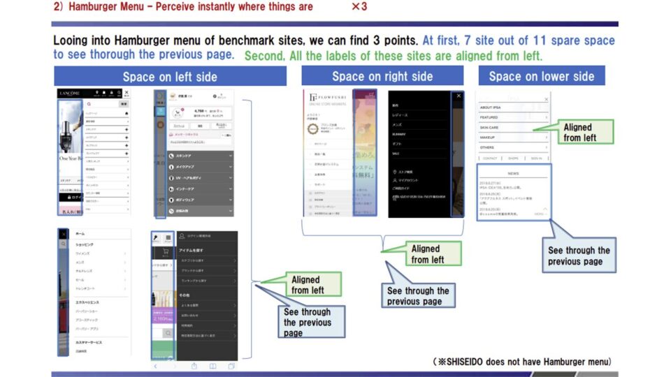
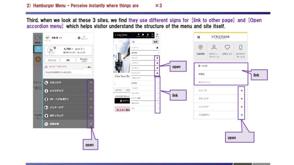
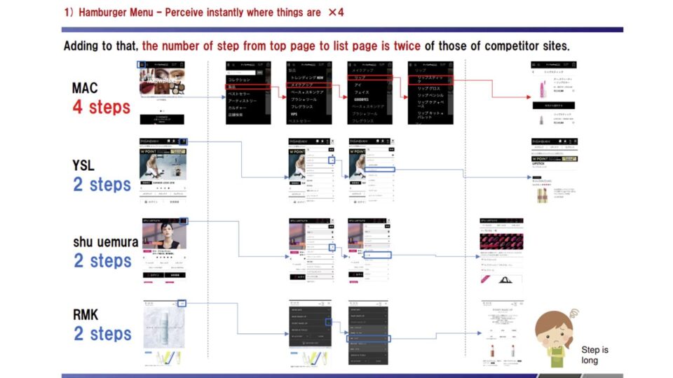
調査の中で特に目立った課題は、スマートフォン閲覧時におけるグローバルナビゲーション(ハンバーガーメニュー)の構造に関するものです。
メニューの階層が深く複雑であるため、ユーザーが目的の商品やカテゴリーにスムーズにたどり着けないというユーザビリティ上の問題が指摘されました。メニュー構造をシンプルにし、不要なステップを削減することが急務と言えます。また、リストページにおける商品の探しやすさも重要な論点となりました。
多くの商品を取り扱うブランドでありながら、価格順や新着順といった並び替え(ソート)機能がリストページに実装されておらず、これがユーザーの利便性を低下させている要因となっています。
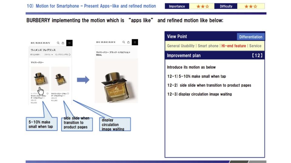
他社サイトでは検索結果の絞り込み機能が充実しているため、MACでも同様の最適化を図る必要があります。さらに、ブランドとしての独自性を表現する上で、スマートフォンサイトでのモーションやビジュアルの見せ方にも工夫が求められます。
既存のコンテンツをうまく活用し、各製品のカテゴリーに応じた適切なアドバイスや使用感を伝えることで、競合他社にはないMAC独自の魅力的な購買体験を構築することが期待されます。
■印象的な課題例
・スマートフォンのハンバーガーメニューの階層が深く、目的の情報に素早くアクセスできない。
・商品数が多いにもかかわらず、リストページに価格順などの並び替え(ソート)機能が存在しない。
・スマホサイトでの独特なモーションの欠如や、アドバイスコンテンツへの導線不足によるブランド体験の低下。
★★★類似の課題について相談したい
—————————————————-
The benchmark of M·A·C Cosmetics’ official online store focused on direct competitors such as YSL, shu uemura, and RMK. The comparison surfaced 18 improvement points across the site: 13 “catch-up” items to match competitors’ standard functionality, and 5 “differentiation” items to bring M·A·C’s distinctive brand value to the fore.
The most prominent issue was the structure of the global navigation (hamburger menu) on smartphones. Its menu hierarchy was deep and complex, preventing users from smoothly reaching the products or categories they wanted—a clear usability problem. Simplifying the menu structure and cutting unnecessary steps was an urgent priority. Findability on list pages was another key point: despite the brand’s broad catalog, the list pages offered no sorting—by price or by newest, for example—which undercut usability.
Because competitors offered robust filtering of search results, M·A·C needed the same optimization. To express the brand’s distinctiveness, the motion and visual presentation on the smartphone site also called for refinement. By making good use of existing content and conveying advice and a sense of each product tailored to its category, M·A·C can build an appealing purchase experience that competitors cannot match.
■Notable issues
・The smartphone hamburger menu’s hierarchy was deep, preventing quick access to the desired information.
・Despite a large catalog, the list pages had no sorting function, such as by price.
・A lack of distinctive motion on the smartphone site and weak pathways to advice content diminished the brand experience.
【MAC】競合ベンチマーク評価1
【MAC】競合ベンチマーク評価2
【MAC】競合ベンチマーク評価3
【MAC】競合ベンチマーク評価4
【MAC】競合ベンチマーク評価5
【MAC】競合ベンチマーク評価6
Point.03
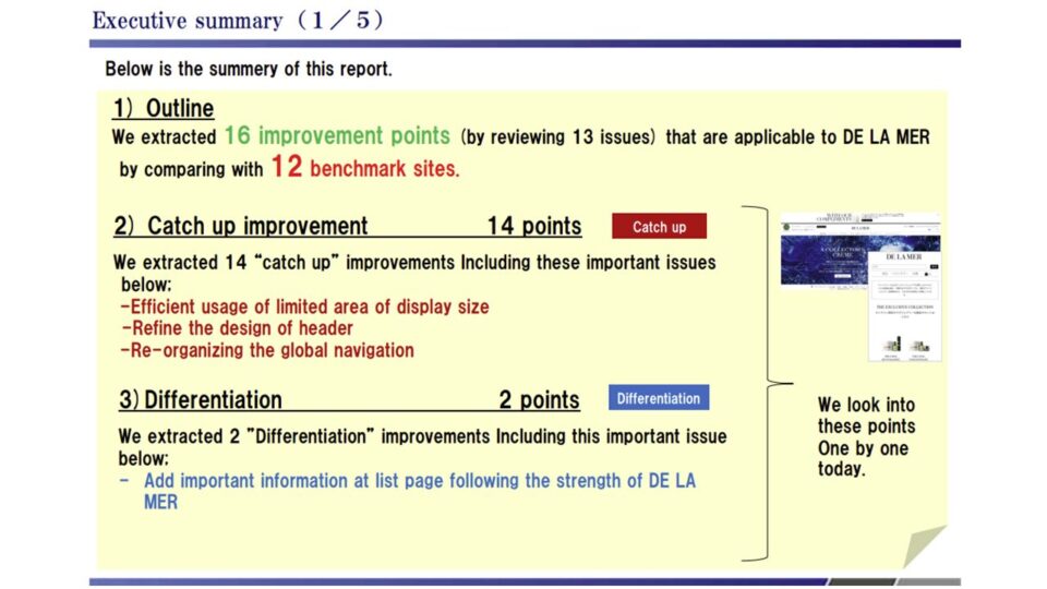
最高峰のスキンケアブランドであるDELAMER(ドゥ・ラ・メール)の競合ベンチマーク評価では、CHANEL、Dior、GUERLAINといったトップクラスのラグジュアリーブランドを対象に比較分析が行われました。
この調査によって、他社水準を満たすための「Catchup」項目が14点、独自の強みを打ち出す「Differentiation」項目が2点、合計16の具体的な改善点が抽出されています。
最も顕著な課題として挙げられたのは、スマートフォンの限られた画面領域の非効率な利用です。
サイト上部にある大きなバナーや、画面下部を占有するフッターナビゲーションの影響で、ユーザーが実際に商品を閲覧できる領域が画面全体の約40%程度にまで狭まってしまっていることが判明しました。
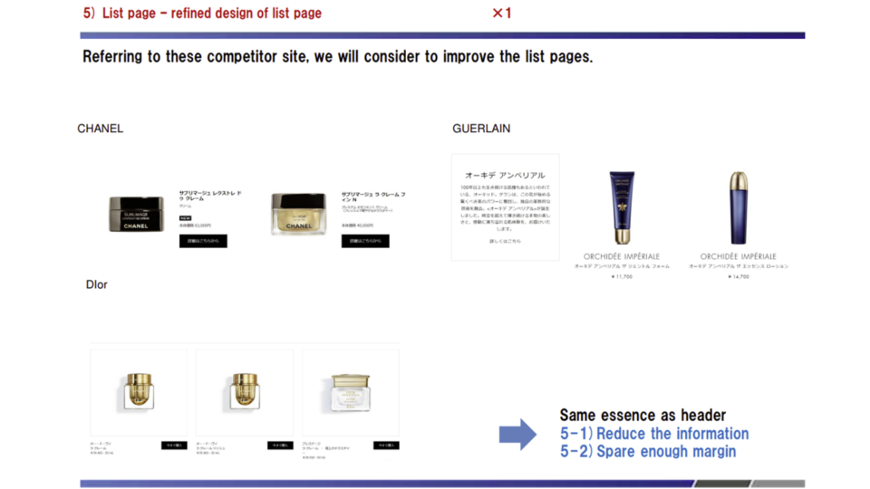
バナーを閉じられるようにしたり、スクロールに合わせてフッターを非表示にするなどの工夫により、閲覧エリアを75%程度まで拡大し、快適なショッピング環境を提供することが推奨されました。また、リストページのデザイン洗練化と情報設計も見直すべきポイントです。
高級感のあるブランドイメージを保ちつつ、商品の特長やアワード受賞歴といった強みを端的に伝える情報をリストページに追加することで、他社との差別化を図ることが求められています。さらに、サービス面での比較において、競合他社の多くが実店舗と連携したポイントプログラムや送料無料サービスなどを導入している中、DELAMERにはそうしたロイヤルティを高める仕組みが不足していることも確認されました。
公式サイトで直接購入することの明確なメリットをユーザーに提示することが、今後のEC展開における大きな鍵となるでしょう。
■印象的な課題例
・スマホ画面の大部分をバナーやフッターが占有しており、実際のコンテンツ閲覧領域が著しく狭い。
・リストページにおいて、商品の強みやアワード受賞歴など、ユーザーの興味を惹く情報が不足している。
・競合が導入しているポイントプログラムや特典など、公式サイトで購入する強力な動機付けが弱い。
—————————————————-
For La Mer, a pinnacle skincare brand, the benchmark compared it against top-tier luxury brands such as CHANEL, Dior, and Guerlain. The study identified 16 concrete improvement points: 14 “catch-up” items to meet competitors’ standards and 2 “differentiation” items to assert the brand’s unique strengths.
The most striking issue was inefficient use of the smartphone’s limited screen space. A large banner at the top and a footer navigation occupying the bottom shrank the area where users could actually view products to roughly 40% of the screen. We recommended making the banner dismissible and hiding the footer on scroll to expand the viewing area to about 75%, creating a more comfortable shopping environment. Refining the list-page design and information architecture was another point to revisit.
While preserving the brand’s premium image, La Mer needed to differentiate itself by adding concise information on list pages that conveys product strengths and award history. On the service side, many competitors had introduced points programs linked to physical stores and free-shipping offers, whereas La Mer lacked such loyalty-building mechanisms. Clearly presenting the benefits of buying directly on the official site will be a major key to its future EC growth.
■Notable issues
・Banners and the footer occupied most of the smartphone screen, leaving a strikingly narrow area for actual content.
・List pages lacked compelling information such as product strengths and award history.
・Strong incentives to buy on the official site—points programs and perks that competitors offered—were weak.
【DELAMER】競合ベンチマーク評価1
【DELAMER】競合ベンチマーク評価2
【DELAMER】競合ベンチマーク評価3
Point.04
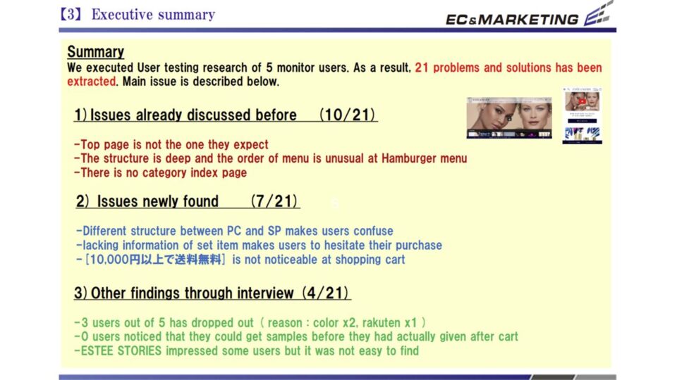
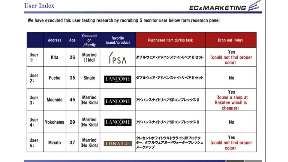
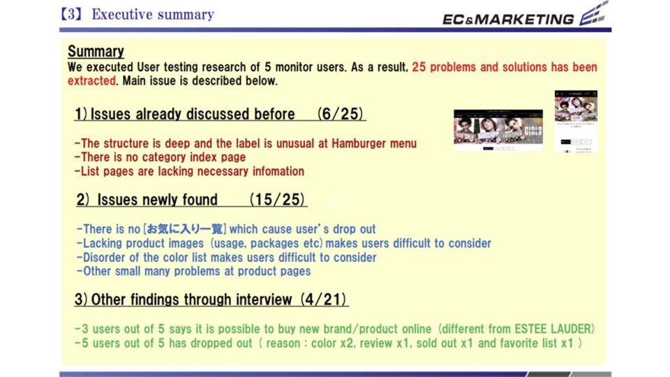
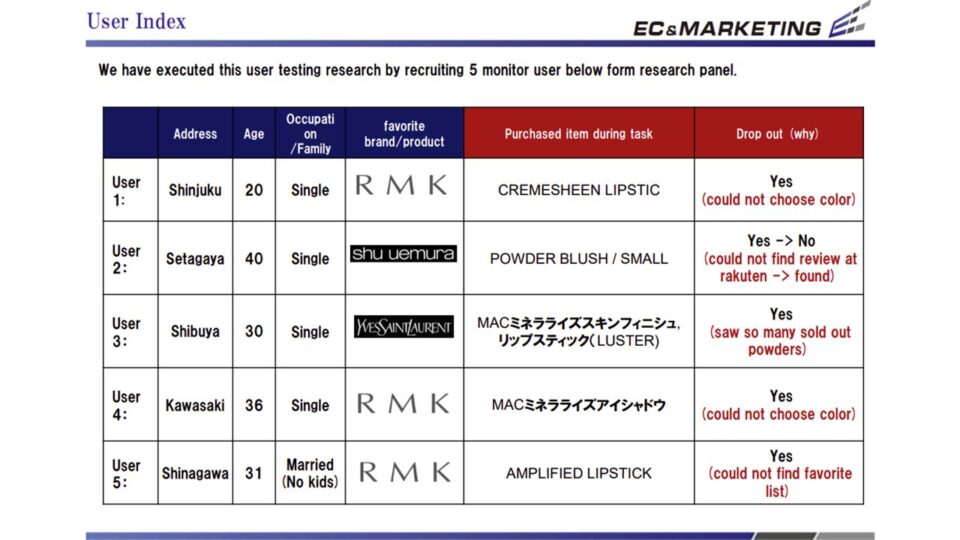
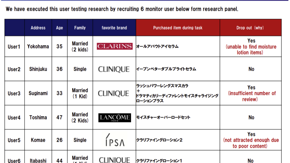
エスティローダーの被験者テストは、ターゲット層となる5名のモニターユーザーを対象に、実際のサイト操作を通じて行われました。
ユーザーの生の声と行動観察から、ECサイトが抱える21の実践的な課題と解決策が導き出されています。
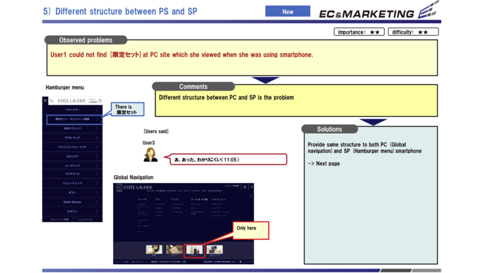
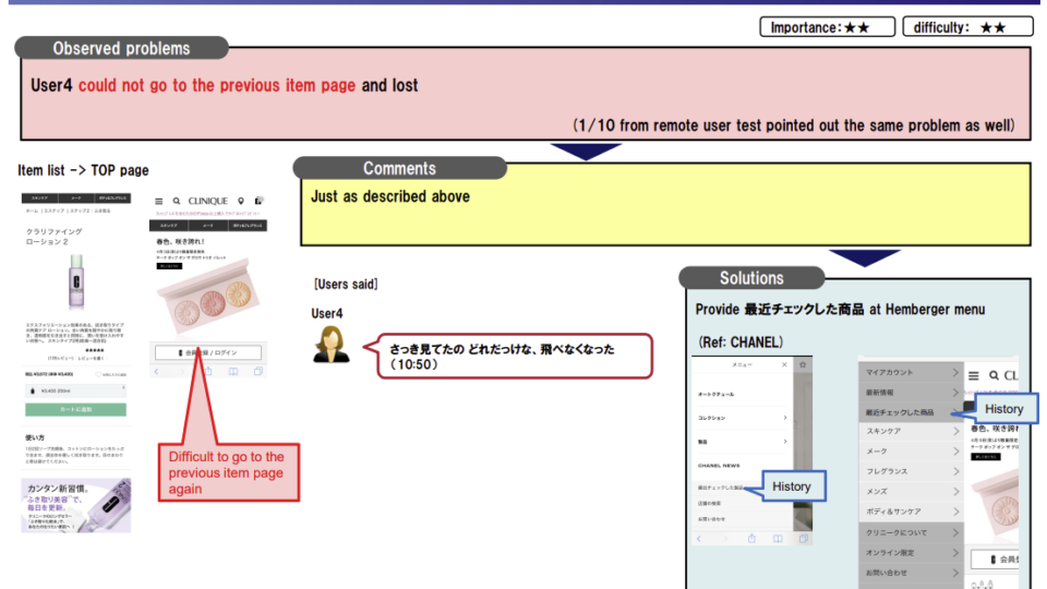
テストを通じて最も多く寄せられた不満は、サイトのナビゲーションに関するものでした。
トップページがユーザーの期待する情報を提示できていないことに加え、ハンバーガーメニューの構造が複雑で、どこに何があるのか直感的に理解しづらいという問題が浮き彫りになりました。さらに、PCサイトとスマートフォンサイトでメニューの構造が異なっている点も、複数デバイスを使い分けるユーザーにとって大きな混乱の元となっています。
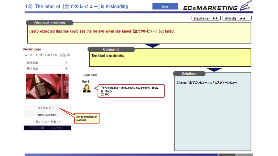
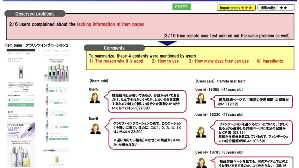
購買プロセスの中核をなすチェックアウト画面においても課題が見つかりました。
エスティローダーの特典であるサンプル選択画面において、各サンプルの具体的な説明や効能(例えば美容液の詳しい効果など)がカタカナ表記のみで十分に伝わらず、どれを選べばよいか迷ってしまうユーザーの姿が観察されました。情報不足はユーザーの決断を遅らせる要因となります。
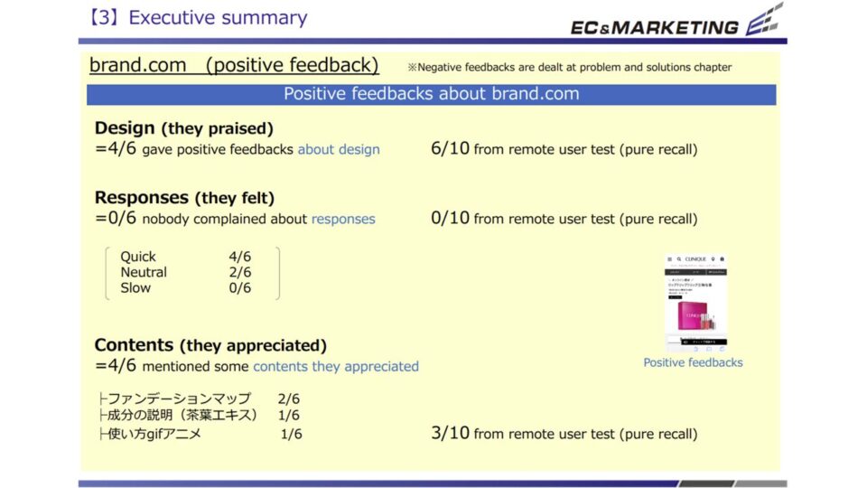
一方で、ブランドの成り立ちや哲学を伝えるコンテンツ「ESTEESTORIES」は、実際に閲覧したユーザーからは「ブランドへの親しみが増した」と高く評価されました。しかし、現状ではサイト内の導線が弱く、多くのユーザーがその存在に気づいていないという非常にもったいない状況です。
魅力的なコンテンツを適切なタイミングでユーザーに届けるUI設計が、ブランドロイヤリティ向上に不可欠であると結論づけられました。
■印象的な課題例
・ハンバーガーメニューの構造が複雑な上、PCとスマホで構成が異なりユーザーを混乱させている。
・サンプル選択時に商品の詳細な説明がなく、どれを選ぶべきかユーザーが判断しづらい。
・高い評価を得られる読み物コンテンツ「ESTEESTORIES」への導線が弱く、見つけにくい。
★★★同様の課題に関する意見を聞きたい
—————————————————-
Estée Lauder’s user testing was conducted with five monitors from the target segment, working through the live site. Their candid feedback and observed behavior produced 21 practical issues and solutions. The most frequent complaint concerned navigation: the homepage failed to present the information users expected, and the hamburger menu’s complex structure made it hard to intuit where things were. The menu structure also differed between the PC and smartphone sites—a major source of confusion for users who switch between devices.
The checkout screen—the core of the purchase process—also revealed issues. On the sample-selection screen offering Estée Lauder’s free samples, the descriptions and benefits of each sample (such as the detailed effects of a serum) were given in katakana only and didn’t come through, leaving users unsure which to choose. Such information gaps slow the decision. By contrast, “ESTÉE STORIES”—content conveying the brand’s origins and philosophy—was highly praised by users who actually saw it as deepening their affinity for the brand. Unfortunately, the in-site pathway to it was weak, and many users never knew it existed. We concluded that UI design that delivers compelling content at the right moment is essential to building brand loyalty.
■Notable issues
・The hamburger menu was complex, and its structure differed between PC and smartphone, confusing users.
・During sample selection there were no detailed product descriptions, making it hard for users to decide.
・The pathway to the well-received editorial content “ESTÉE STORIES” was weak and hard to find.
【エスティローダー】被験者テスト
【エスティローダー】被験者テスト2
【エスティローダー】被験者テスト3
【エスティローダー】被験者テスト4
Point.05
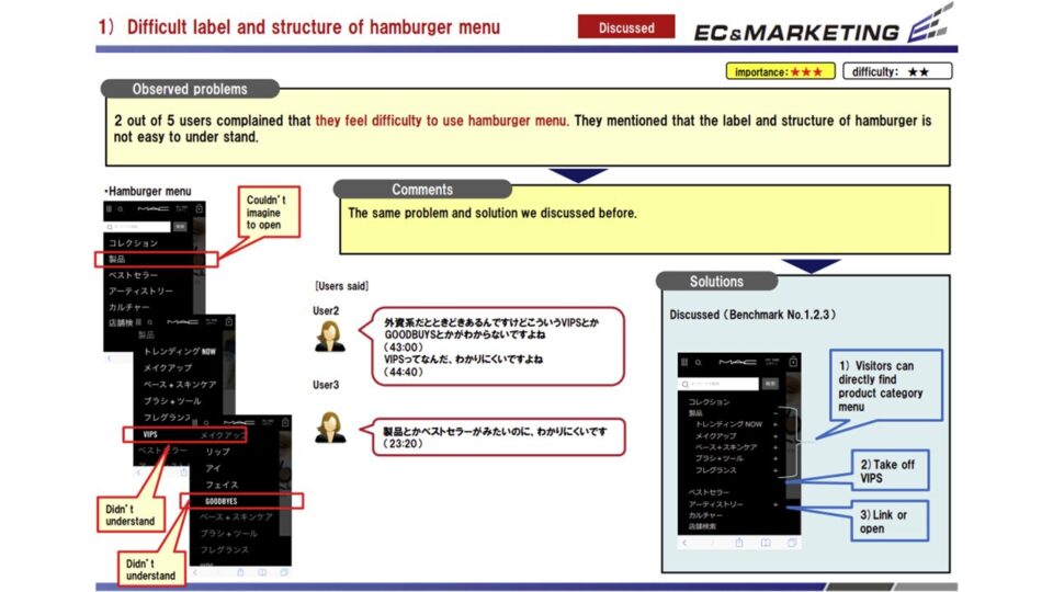
MACコスメティックスの公式ECサイトにおける被験者テストも、5名のモニターを対象に実施され、合計25項目の課題と改善案が抽出されました。
MAC特有の洗練されたデザインが、かえってユーザビリティを損ねている実態が明らかになっています。
ユーザーが最初に直面した壁は、メニューの視認性と理解度です。
ハンバーガーメニューを開いた際、フォントサイズが大きすぎるために全体が見渡しにくく、MACの持つ「オシャレ感」が削がれているという指摘がありました。また、「VIPS」「GOODBYES」「アーティストリー」といったブランド独自の専門的なメニュー名が並んでおり、一般的な化粧品を探しに来たユーザーが直感的にカテゴリーを判別できない傾向が見られました。
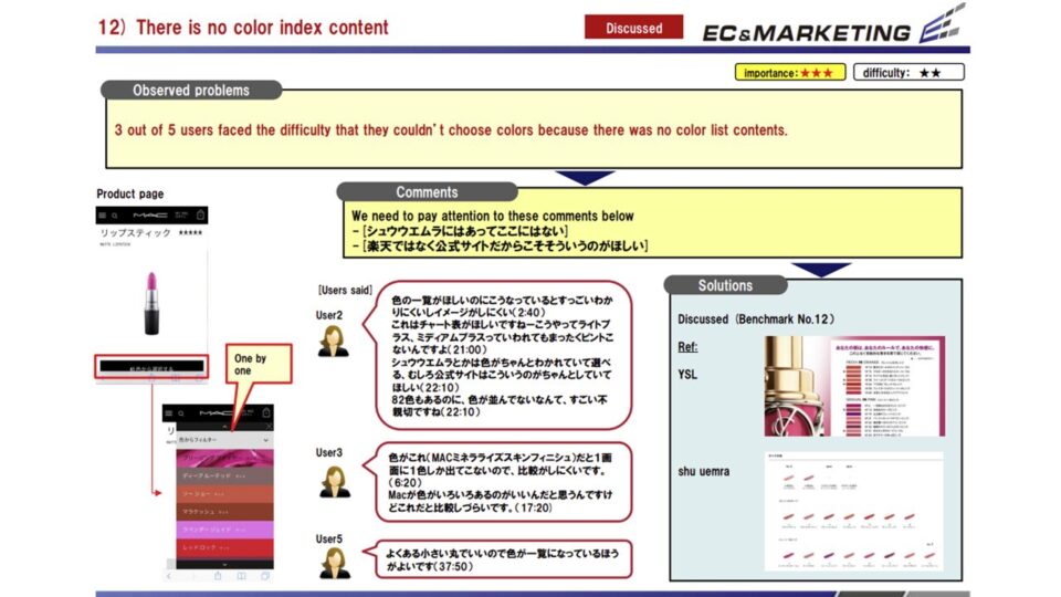
商品詳細ページにおいても、デザイン性を優先するあまり、商品説明のテキストサイズが小さすぎて読みにくいという声が多数挙がりました。さらに、商品の素材や色に関する具体的な情報が不足しており、特にカラーバリエーションが豊富なブランドであるにもかかわらず、カートに入れるまで在庫状況が分からない仕様は、購入意欲を大きく削ぐ結果となっています。
ブランドの独自性を発信する「アーティストリー」などのコンテンツは、一部のファンには響くものの、一般的なユーザーには見つけにくく、十分に活用されていません。
今後は、MACらしいモードでクールな世界観を損なうことなく、初めてサイトを訪れたユーザーでも迷わずに商品を選び、購入できる親切なナビゲーションと情報設計を両立させることが最大の課題と言えます。
■印象的な傾向例
・メニューの文字が大きすぎることや、「VIPS」等の専門用語が多用され、直感的な操作を妨げている。
・商品説明の文字が小さく、商品の素材や色に関する具体的な情報が不足しているため購入を躊躇させる。
・カラーを選択するまで在庫状況が確認できないため、購入プロセスでの離脱を招きやすい。
—————————————————-
User testing of M·A·C Cosmetics’ official EC site was also run with five monitors, producing 25 issues and improvement ideas in total. It became clear that M·A·C’s signature, polished design was in fact undermining usability. The first wall users hit was the legibility and comprehensibility of the menu.
When users opened the hamburger menu, the font size was so large that the whole was hard to take in—diminishing the very sense of style M·A·C is known for. The menu also lined up brand-specific, insider names such as “VIPS,” “GOODBYES,” and “Artistry,” so users who came simply to find ordinary cosmetics struggled to tell the categories apart intuitively.
On product detail pages, too, many testers said the description text was too small to read because design had been prioritized over legibility. Concrete information on materials and colors was also lacking; and for a brand with an especially wide range of color variations, the fact that stock status wasn’t shown until an item was added to the cart significantly dampened the desire to buy.
Content that broadcasts the brand’s distinctiveness, such as “Artistry,” resonated with some fans but was hard for ordinary users to find and went underused. Going forward, the greatest challenge is to reconcile two goals: preserving M·A·C’s edgy, cool worldview while providing navigation and information design helpful enough that even first-time visitors can choose and buy products without getting lost.
■Notable issues
・Oversized menu text and heavy use of insider terms like “VIPS” got in the way of intuitive use.
・Small description text and a lack of concrete material and color information made users hesitate to buy.
・Stock status couldn’t be checked until a color was selected, inviting drop-off during the purchase process.
【MAC】被験者テスト1
【MAC】被験者テスト2
【MAC】被験者テスト3
【MAC】被験者テスト4
【MAC】被験者テスト5
Point.06
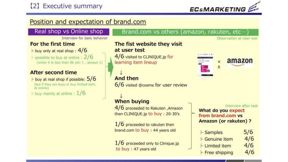
クリニークの公式ECサイトと、Amazonをはじめとする巨大モールとの比較調査では、ユーザーが各チャネルをどのように使い分けているかという購買心理が深く掘り下げられました。この調査は、ブランド直営サイトが持つべき存在意義を再確認する重要なプロセスとなりました。
調査の結果、ユーザーの多くは「初めての購入は百貨店などの実店舗で色や使用感を確かめ、2回目以降のリピート購入でオンラインを利用する」という堅実な行動パターンを持っていることが確認されました。
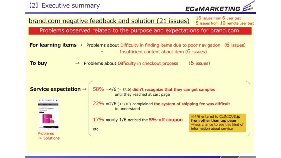
オンラインでの購入先を選ぶ際、ユーザーがAmazonや楽天に対して公式ECサイトに期待する最大のメリットは、「無料サンプルの提供」「正規品であるという絶対的な安心感」「公式限定アイテムの存在」、そして「送料無料」といったプレミアムな付加価値です。しかし、実際のサイト操作テストでは、クリニーク公式ECのUI/UXがこれらの期待を十分にサポートできていないことが判明しました。
例えば、無料サンプルが何個選べるのかという重要な説明が欠けていたり、カート画面での情報が不足しているため、ユーザーが戸惑う場面が見受けられました。また、個人情報を入力するフォームの枠が小さく、フリガナの自動入力機能も備わっていないため、購入完了までの入力ストレスが大きいことも離脱の原因となっています。さらに、クリニーク独自の強みである「3ステップスキンケア」やコンテンツページ「TheWink」の価値が、ユーザーに的確に伝わっていないという課題も浮き彫りになりました。
公式ECサイトがモールに対抗するためには、こうした直営ならではの独自コンテンツとサービスを、より直感的で使いやすいUIを通じてユーザーに届けることが急務です。
■印象的な課題例
・無料サンプルが何個選べるかなど、特典に関する説明不足がユーザーの期待を裏切っている。
・入力フォームの枠が小さく、自動入力機能もないため、決済時のユーザビリティが低い。
・「3ステップ」等の独自コンテンツの魅力が伝わりきれておらず、モールとの差別化が不十分。
—————————————————-
Comparing CLINIQUE’s official EC site with giant marketplaces like Amazon, this study dug deep into the purchase psychology of how users choose between channels. It became an important process for reaffirming the reason a brand’s own direct site should exist.
The study confirmed that most users follow a steady pattern: they make a first purchase at a physical store such as a department store, checking color and feel, then use online channels for repeat purchases from the second time on. When choosing where to buy online, the biggest benefits users expect from an official EC site over Amazon or Rakuten are premium value-adds: free samples, the absolute reassurance of genuine products, the existence of official-exclusive items, and free shipping. In the live site tests, however, CLINIQUE’s official EC UI/UX did not adequately support these expectations.
For example, key explanations—such as how many free samples a user could choose—were missing, and information on the cart screen was insufficient, leaving users puzzled. The personal-information form fields were small and had no auto-fill for phonetic readings (furigana), so the input burden up to order completion was heavy—another cause of drop-off. The study also revealed that the value of CLINIQUE’s distinctive strengths—its “3-Step Skin Care” and the content page “The Wink”—was not being conveyed accurately to users.
For the official EC site to compete with the marketplaces, delivering these direct-channel-only content and services through a more intuitive, easy-to-use UI is an urgent priority.
■Notable issues
・Insufficient explanation of perks—such as how many free samples could be chosen—let users down.
・Form fields were small with no auto-fill, resulting in poor usability at checkout.
・The appeal of proprietary content like “3-Step” wasn’t fully conveyed, leaving weak differentiation from the marketplaces.
【CLINIQUE vs Amazon】被験者テスト1
【CLINIQUE vs Amazon】被験者テスト2
【CLINIQUE vs Amazon】被験者テスト3
【CLINIQUE vs Amazon】被験者テスト4
【CLINIQUE vs Amazon】被験者テスト5
【CLINIQUE vs Amazon】被験者テスト6
【CLINIQUE vs Amazon】被験者テスト7
本プロジェクトを通じ、大手百貨店コスメブランドにおける公式ECサイトの真の役割と、あるべきUI/UXの姿が明確に示されました。
百貨店ブランドの化粧品は比較的高単価であるため、EC市場が急速に拡大している現在においても、依然として「実店舗(カウンター)で美容部員のアドバイスを受けながら、直接商品を手に取って買いたい」と考えるユーザーが多数を占めています。その中で、ブランド公式ECが単なる「オンライン上の販売窓口」にとどまるべきか、あるいはそれ以上の役割を果たすべきか、深く考えさせられる結果となりました。
調査から見えてきたユーザーの典型的な行動モデルは、非常に示唆に富んでいます。
ユーザーは「初回購入時は百貨店で自分の肌に合う色やテクスチャーを慎重に確認して購入し、自分の定番アイテムとなった2回目以降は、手軽なECサイトで指名買いをする」という使い分けを巧みに行っています。
さらに、並行輸入品などが流通するAmazonや楽天といった巨大モールと比較した際、ユーザーは「品質への不安を払拭し、定価であっても確実に本物を手に入れたい」という強い心理から公式サイトを選択しています。
基本的にメーカーの公式サイトでは、モールのような大幅な値引きやポイント還元競争を行うことが困難です。だからこそ、金額的なインセンティブに代わる「公式サイトをあえて選ぶメリット」を戦略的に設計し、それをUI/UXとして実装しなければなりません。今回の調査で明らかになった「サンプルの充実とその分かりやすい提示」「ブランドの哲学を伝える上質なコンテンツへのスムーズな導線」「ストレスのない洗練された購買プロセス」は、まさにそのメリットを形にするための具体的な処方箋です。
UI/UXの改善は、単にボタンの位置を変えたりデザインを整えたりする表面的な改修ではありません。それは、実店舗で得られるような「ブランドのホスピタリティ」をデジタル上でいかに再現し、顧客のロイヤリティを深めるかという経営戦略そのものです。
今回のミッションに対し、徹底した競合ベンチマークとリアルな被験者テストから得られた貴重な調査結果は、同社の日本市場におけるEC事業の飛躍に大きく貢献することでしょう。
公式ECサイトの運営を担うすべてのブランド担当者にとって、本プロジェクトの緻密なプロセスとユーザー起点の改善アプローチは、自社サイトの価値を再定義し、モールや実店舗と相乗効果を生み出すための強力な羅針盤となるはずです。
★★★このプロジェクト事例をもとに相談したい
—————————————————-
This project made clear the true role of the official EC site for a major department-store beauty brand, and what its UI/UX ought to be. Because department-store cosmetics carry relatively high price points, even now—amid rapid EC market growth—a majority of users still want to handle products directly and buy with a beauty advisor’s guidance at the in-store counter. Against that backdrop, the findings prompted deep reflection on whether a brand’s official EC site should remain a mere “online sales window” or play a larger role.
The typical user behavior model that emerged is highly instructive. Users skillfully divide their channels: on a first purchase they carefully check at a department store which color and texture suit their skin, and once an item becomes a staple, from the second purchase on they make targeted repeat buys on the convenient EC site. Moreover, compared with giant marketplaces like Amazon and Rakuten—where parallel imports also circulate—users choose the official site out of a strong desire to dispel quality concerns and obtain the genuine article for certain, even at list price.
Fundamentally, a manufacturer’s official site can hardly engage in the steep discounting and points-rebate wars of the marketplaces. That is precisely why the brand must strategically design “reasons to deliberately choose the official site” in place of monetary incentives, and implement them as UI/UX. The points this study brought to light—a rich, clearly presented sample offering; a smooth pathway to high-quality content that conveys the brand’s philosophy; and a frictionless, refined purchase process—are concrete prescriptions for giving those reasons form. Improving UI/UX is not a surface-level fix of moving buttons or tidying the design. It is, in itself, a management strategy for how to reproduce the “brand hospitality” found in physical stores within the digital realm and deepen customer loyalty.
For this mission, the valuable findings drawn from thorough competitive benchmarking and real user testing should contribute greatly to the leap forward of the company’s EC business in the Japanese market. For every brand manager responsible for running an official EC site, this project’s meticulous process and user-first improvement approach should serve as a powerful compass for redefining a site’s value and creating synergy with marketplaces and physical stores.
Related Works
様々な課題解決事例・制作実績を掲載しています。
業界や商材が異なっても構造が近いケースは多くあります。
「自社の場合、どのように解決できるか聞きたい」
「予算内でどんなことができるか知りたい」
という方はお気軽にお問い合わせください。
貴社サイトの状況や課題感にあわせて近い成功例や改善の方向性をご案内します。
Consulting Specialist