様々な課題解決事例・制作実績を掲載しています。
業界や商材が異なっても構造が近いケースは多くあります。
「自社の場合、どのように解決できるか聞きたい」
「予算内でどんなことができるか知りたい」
という方はお気軽にお問い合わせください。
貴社サイトの状況や課題感にあわせて近い成功例や改善の方向性をご案内します。
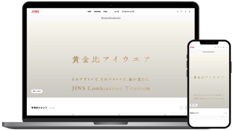
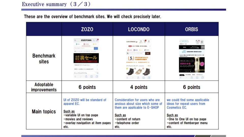
グローバル基準を刷新したデニムブランド公式ECのUI改善
4つの調査手法が導く、次世代の購入体験

Client
リーバイ・ストラウスジャパン株式会社(LeviStraussJapanK.K.)は、デニムやジーンズを中心としたアパレル製品の販売を手掛ける企業です。主力事業の一つとして、LEVI'Sリーバイス公式オンラインショップの運営を行っています。
-----------------------------------------
Levi Strauss Japan K.K. is an apparel company centered on denim and jeans. One of its core businesses is operating the LEVI'S official online store.
Result
4つの独自調査から導いたUIがASEANエリアのデザインフォーマットにも採用されました。
—————————————–
The UI derived from our four proprietary research methods was adopted as the design format for the ASEAN region as well.
Solution
Overview
大手ファッションブランドの公式ECサイトにおいて、グローバル規模でのサイトリニューアルが予定されていました。
それに先立ち、既存サイトのUI/UXに関する課題や改善の方向性を網羅的に把握し、リニューアル時のデザインおよびシステムに反映させる目的で発足したのが本プロジェクトです。
対象がブランド公式ECであるため、楽天やAmazon、ZOZOTOWNなどの大手ECモールも強力な競合となり得ます。その立ち位置を深く考慮し、定性・定量の両面から4つの専門的な調査を実施することで、目標とするCVR(コンバージョン率)の10%改善に向けた課題の洗い出しを行いました。
★★★類似の課題について相談したい
—————————————–
A global-scale website renewal was planned for the official EC site of this major fashion brand. Ahead of that renewal, this project was launched to comprehensively map the existing site’s UI/UX issues and improvement priorities, and to feed those findings into the new design and system.
Because the site is a brand-owned EC store, major marketplaces such as Rakuten, Amazon, and ZOZOTOWN are also formidable competitors. Taking that positioning fully into account, we ran four specialized studies spanning both qualitative and quantitative methods to surface the issues standing in the way of the target 10% improvement in conversion rate (CVR).
Process
Point.01
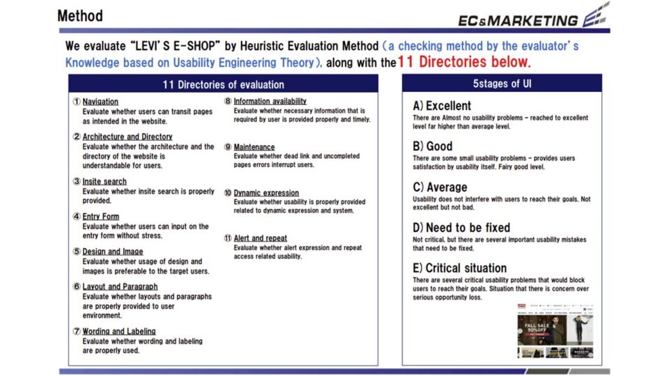
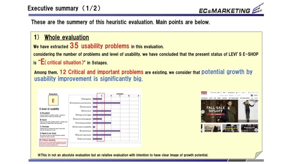
PCサイトを対象に、ユーザビリティの専門家が11の評価基準(ナビゲーション、サイト内検索、入力フォーム、情報提供など)を用いてヒューリスティック評価を実施しました。
全体で35件の課題が抽出され、5段階評価で最低ランクの「E(危機的状況)」と厳しい結果が示されています。
しかし同時に、これらの重大な課題を改善することで、サイトの成長ポテンシャルは非常に大きいとも結論づけられました。特に、ブランド特有の専門用語に依存したナビゲーションや、購入に直結する送料などの情報提示不足、さらにはカートボタンの目立たなさなど、初見ユーザーにとってハードルとなる要素が多く見つかっています。
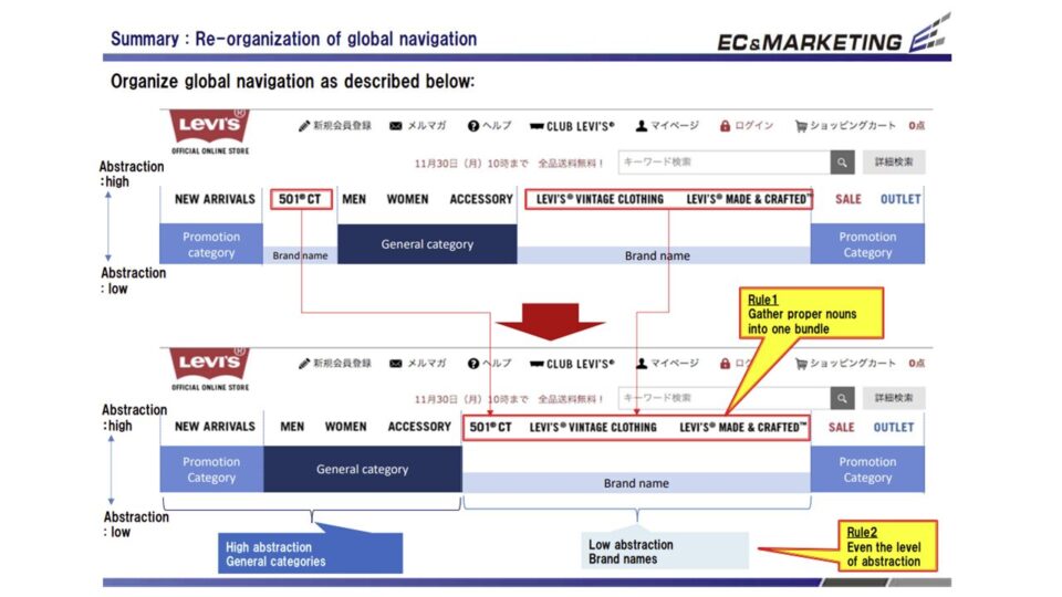
■印象的な課題例
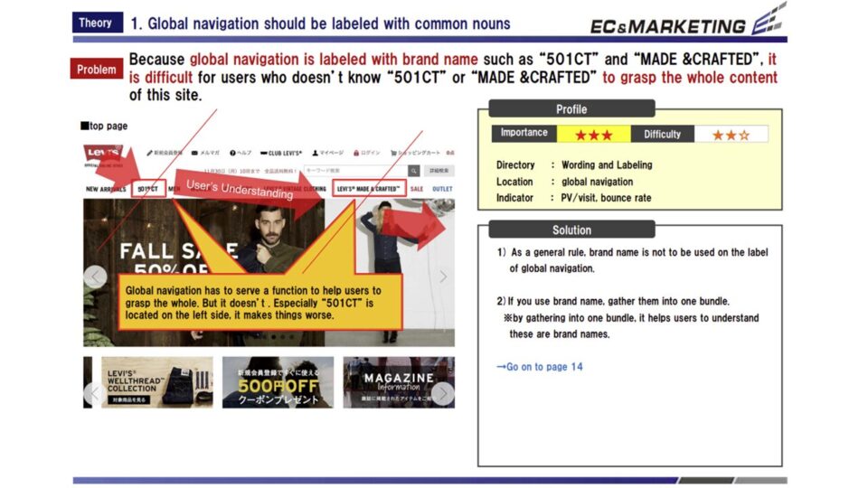
・グローバルナビゲーションに「501CT」などブランド名がそのまま使われており、知識のないユーザーには内容が伝わらない。
・「送料無料」などサイト独自のメリットが十分にアピールされておらず、商品ページでも配送料などの重要情報が確認しづらい。
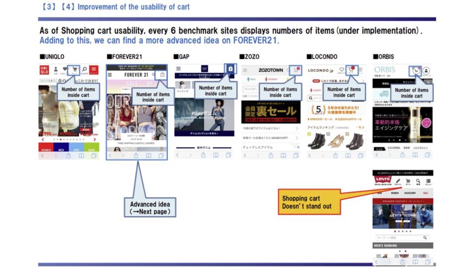
・ショッピングカートのデザインが弱く目立たないうえに、画面スクロール時に表示されるメニューと重なって隠れてしまう。
—————————————————-
Usability experts ran a heuristic evaluation of the PC site against 11 criteria, including navigation, on-site search, input forms, and information delivery.
In total, 35 issues were identified, and the site scored “E (critical)”—the lowest of the five grades. At the same time, we concluded that fixing these serious issues would unlock substantial growth potential. In particular, we found many barriers for first-time visitors: navigation that relied on brand-specific jargon, insufficient display of purchase-critical information such as shipping fees, and a cart button that failed to stand out.
■Notable issues
・The global navigation used product names like “501CT” verbatim, which meant nothing to users unfamiliar with the line.
・Site-specific benefits such as “free shipping” were under-promoted, and key information like delivery fees was hard to find even on product pages.
・The shopping-cart design was weak and easy to miss, and it was further obscured by the menu that appeared on scroll.
ヒューリスティック評価1
ヒューリスティック評価2
ヒューリスティック評価3
ヒューリスティック評価4
ヒューリスティック評価5
ヒューリスティック評価6
Point.02
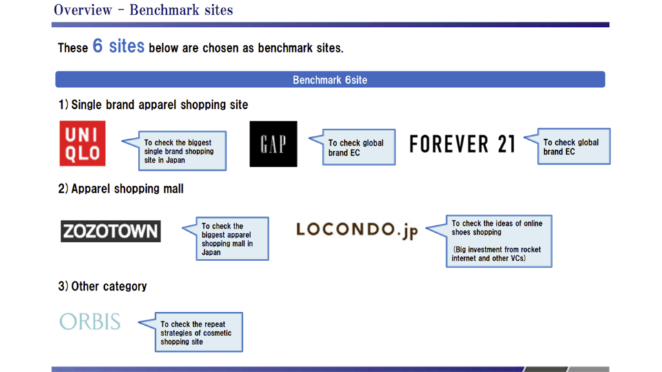
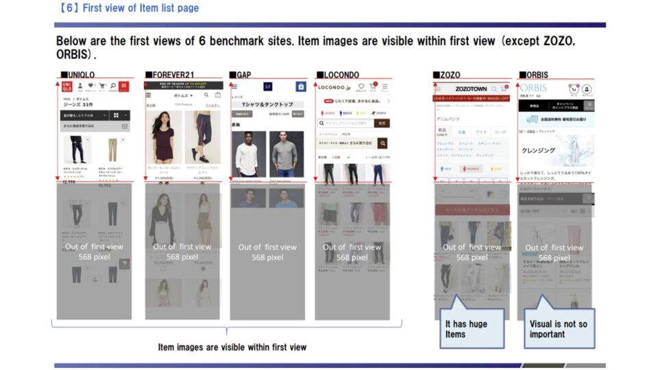
スマートフォン(SP)サイトに焦点を当て、UNIQLOやZOZOTOWN、GAPといった競合他社6サイトとのベンチマーク比較を行いました。
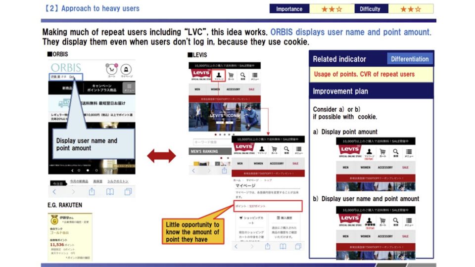
ECモールや同業他社の優れたUIを分析した結果、LEVI’SE-SHOPに取り入れるべき19件の改善ポイントが抽出されました。
このうち14件は他社に追いつくための「キャッチアップ」施策であり、残り5件は「差別化」のための施策と位置づけられています。
具体的には、ハンバーガーメニューの利便性向上や、カート画面での離脱防止策、さらには女性ユーザー向けのUI改修やサイズに対する不安を払拭するコンテンツの提供が急務であることが判明しました。
★★★自社に近い支援内容を教えてほしい
—————————————————-
Focusing on the smartphone site, we benchmarked it against six competitor sites, including UNIQLO, ZOZOTOWN, and GAP.
Analyzing the strongest UIs across marketplaces and peer brands, we extracted 19 improvement points for the LEVI’S E-SHOP to adopt. Of these, 14 were “catch-up” measures to reach parity with competitors, while the remaining 5 were “differentiation” measures. Specifically, we found urgent needs to improve the hamburger menu’s usability, prevent drop-off on the cart screen, refine the UI for female users, and add content that eases customers’ sizing anxiety.
競合ベンチマーク評価1
競合ベンチマーク評価2
競合ベンチマーク評価3
競合ベンチマーク評価4
競合ベンチマーク評価5
競合ベンチマーク評価6
競合ベンチマーク評価7
Point.03
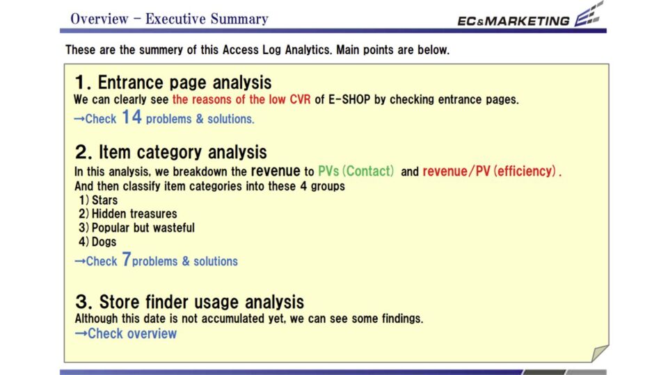
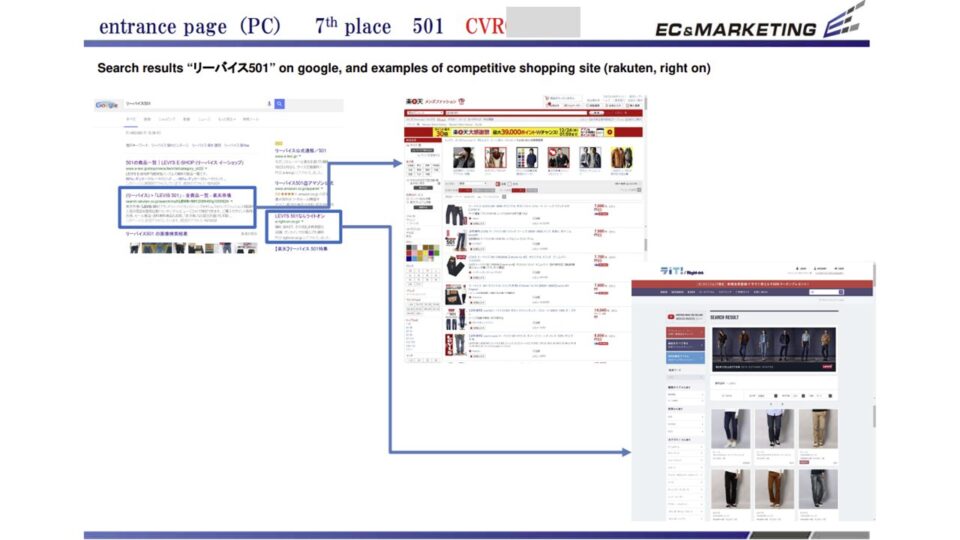
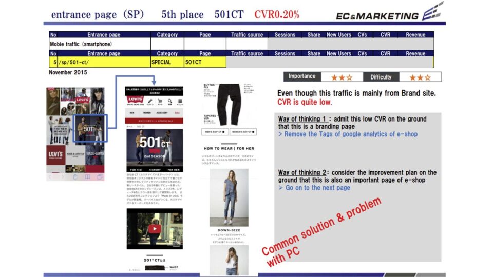
Google Analyticsのデータを用いて、「エントランス(流入)ページ」「商品カテゴリ」「店舗検索の利用状況」の3つの視点からアクセスログ解析を実施しました。
サイトのCVRが低い原因を流入ページごとに特定し、具体的な解決策を提示しています。また、商品カテゴリを「接触量(PV)」と「効率(収益/PV)」という2つの指標でマッピングし、スター、隠れた宝、PVの無駄遣い、落ちこぼれ、の4グループに分類しました。これにより、ブランドワードで検索して流入しているにもかかわらず直帰してしまうユーザーの存在や、カテゴリごとの適切な露出強化戦略が明確になっています。
■印象的な課題例
・「501」などのブランド名検索による流入が多いにも関わらず、遷移先のページに商品画像が少なく、CVRが極めて低い。
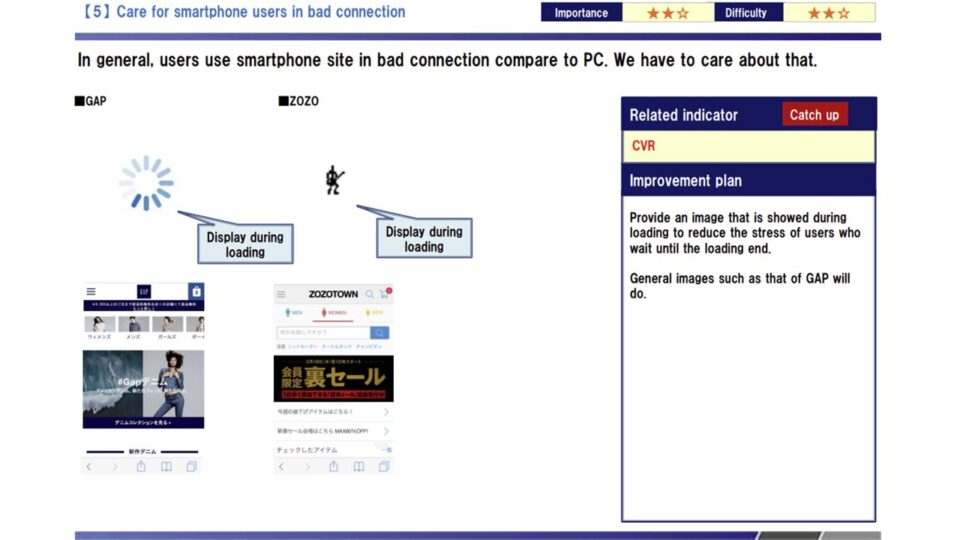
・スマホサイトではPCのような「マウスオーバー」の挙動がないため、バナーやテキストがクリックできる場所かどうかがわかりにくい。
・商品カテゴリごとに「アクセスは多いが買われない」「アクセスは少ないがよく買われる」という明確な差があり、戦略的な露出調整が必要である。
★★★この施策に近いプロジェクトについて聞きたい
—————————————————-
Using Google Analytics data, we analyzed access logs from three angles: entrance (landing) pages, product categories, and store-locator usage. We pinpointed the causes of low CVR on a per-landing-page basis and proposed concrete fixes. We also mapped product categories against two axes—reach (page views) and efficiency (revenue per page view)—and sorted them into four groups: stars, hidden gems, PV wasters, and underperformers. This revealed users who arrived via brand-name searches yet bounced immediately, and clarified the right exposure strategy for each category.
■Notable issues
・Despite heavy traffic from brand-name searches like “501,” the destination pages had few product images and extremely low CVR.
・Without PC-style hover behavior on the smartphone site, users struggled to tell whether banners and text were tappable.
・Categories showed clear splits—”high traffic but low purchase” versus “low traffic but high purchase”—calling for strategic adjustment of exposure.
アクセスログ解析1
アクセスログ解析2
アクセスログ解析3
Point.04
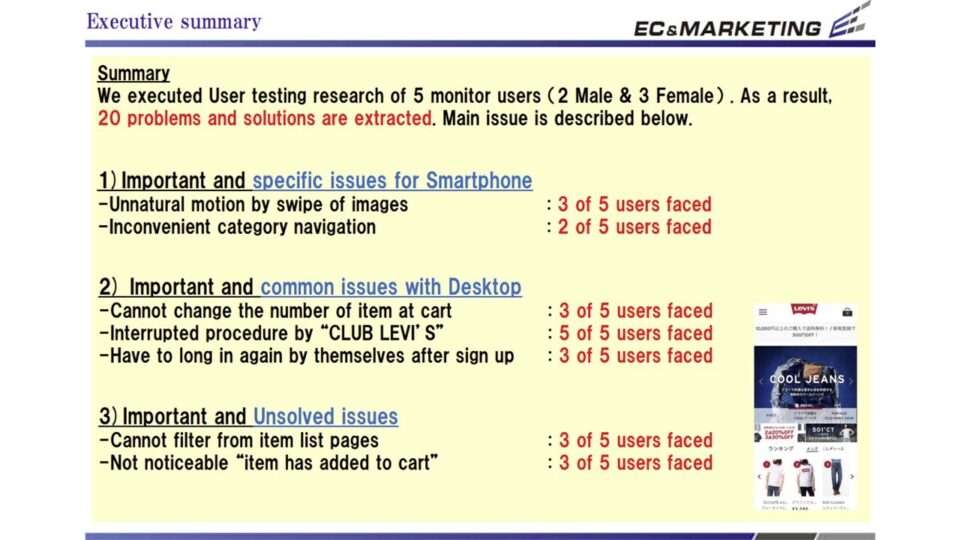
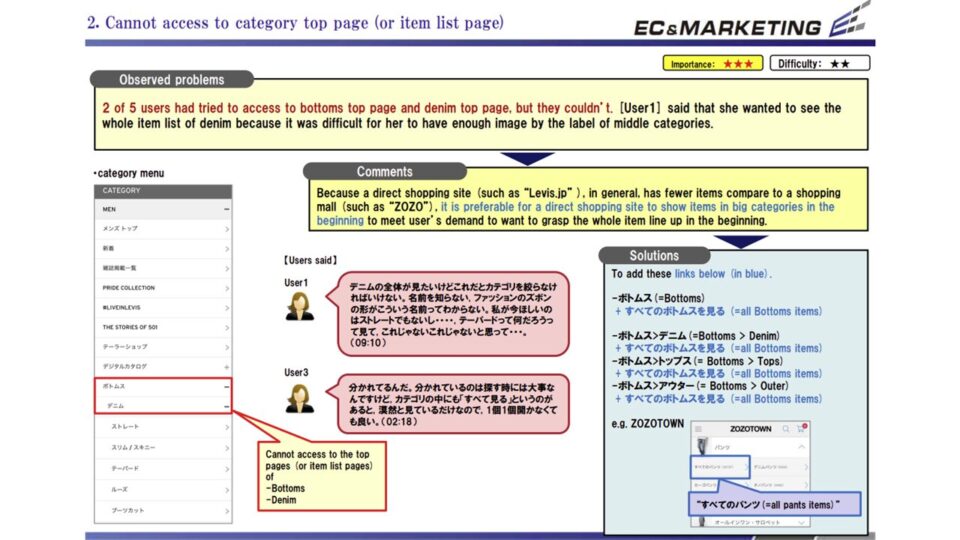
スマートフォンを日常的に利用する男女5名のモニターを対象に、実際のサイトを使って商品の検索から購入までを行ってもらう「ユーザー行動観察調査」を実施しました。
モニターの生の声と操作の様子から、アクセスログだけでは見えない20件の課題が浮き彫りになりました。特に、スマートフォンの画面サイズや操作性に合っていない画像の動き、カテゴリの探しにくさが指摘されています。また、購入手続きに進んだ際に「CLUBLEVI’S(会員プログラム)」への連携画面が説明なく表示され、これがユーザーを混乱させ手続きを中断させる大きな要因となっていることが判明しました。
■印象的な課題例
・商品画像のスワイプ操作が指の動きと連動しておらず、不自然で遅く感じる(5人中3人が指摘)。
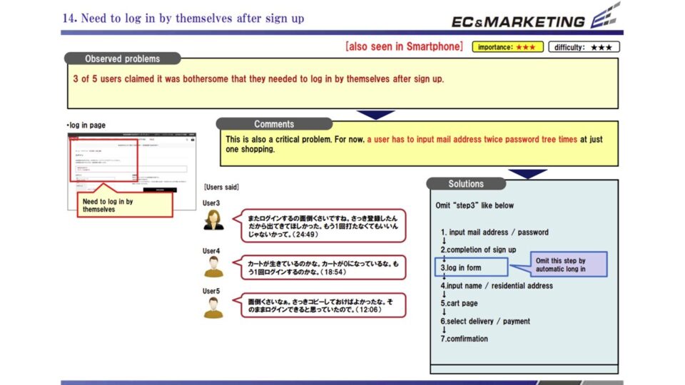
・カートに入れた商品の数量が変更できないうえに、会員登録後に再度ログインを求められるなど、購入動線に大きなストレスがある。
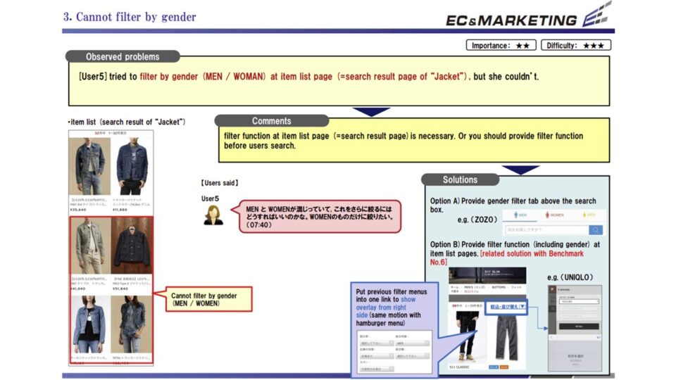
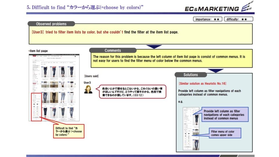
・商品一覧ページから「性別」「色」「価格」による絞り込みができず、目的の商品にたどり着くのが非常に困難である。
★★★このプロジェクト事例をもとに相談したい
—————————————————-
We conducted a “user behavior observation study” with five male and female monitors who use smartphones daily, having them move through the real site from product search to purchase.
The monitors’ candid feedback and observed behavior surfaced 20 issues invisible in access logs alone. They flagged image transitions ill-suited to smartphone screen size and operability, as well as difficulty locating categories. We also found that during checkout, a hand-off screen to “CLUB LEVI’S” (the membership program) appeared with no explanation—a major source of confusion that caused users to abandon the process.
■Notable issues
・Product-image swiping didn’t track finger movement, feeling unnatural and sluggish (noted by 3 of 5 testers).
・Shoppers couldn’t change item quantities in the cart, and were asked to log in again after registering—adding significant friction to the purchase flow.
・The product list offered no filtering by gender, color, or price, making it very hard to reach the intended item.
被験者テスト(スマホ)1
被験者テスト(スマホ)2

被験者テスト(スマホ)3
被験者テスト(スマホ)4
Point.05
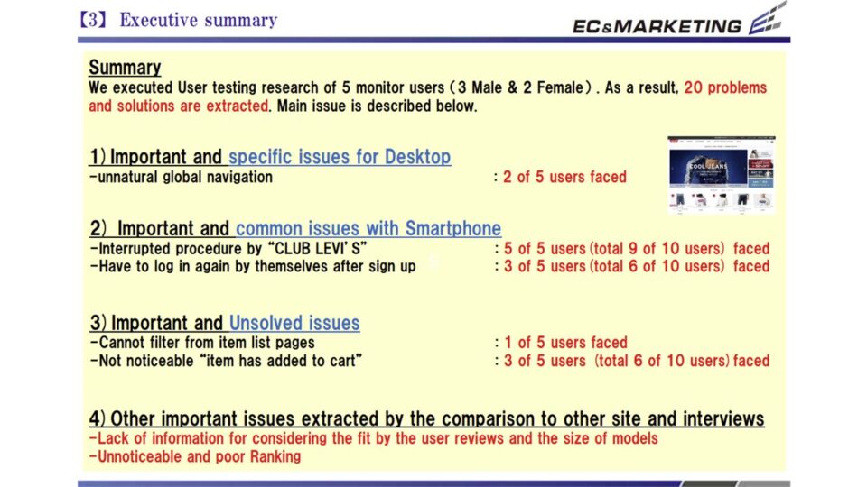
PCサイトにおいても、男女5名のモニターを対象に行動観察調査とインタビューを実施しました。
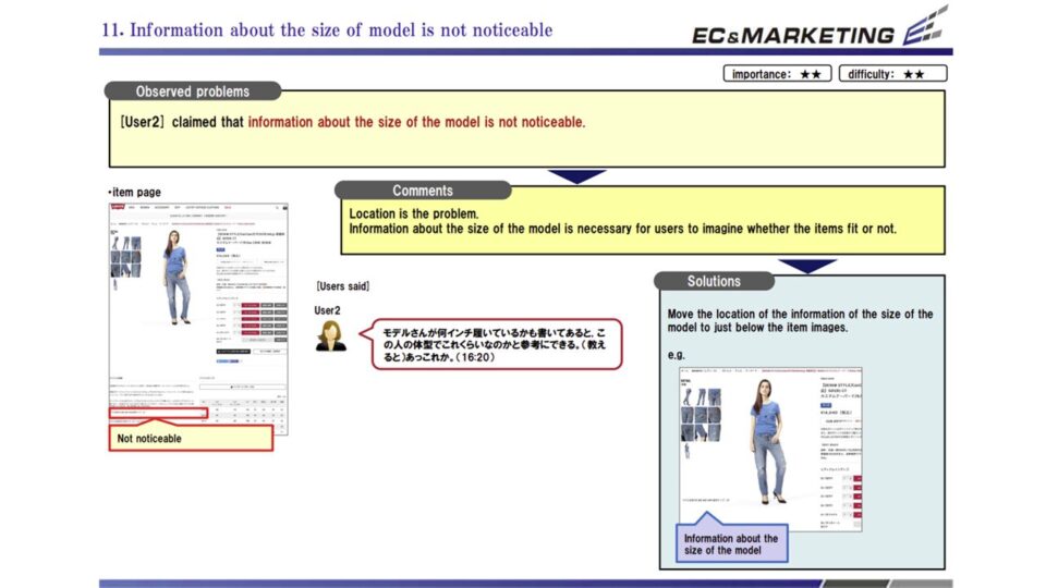
ここではPCならではの広い画面領域を活かしきれていない点や、視線誘導の不備による課題が多数見つかっています。グローバルナビゲーションの構造がユーザーのメンタルモデルと合致しておらず、商品を探す入り口の段階で迷わせてしまうケースが目立ちました。さらに、スマホ版と同様の「CLUBLEVI’S」関連の離脱ポイントに加え、モデルの体型情報や他人のレビューが不足しているため、自分にフィットするかどうかの確信が持てず購入をためらう行動が鮮明に観察されました。
■印象的な課題例
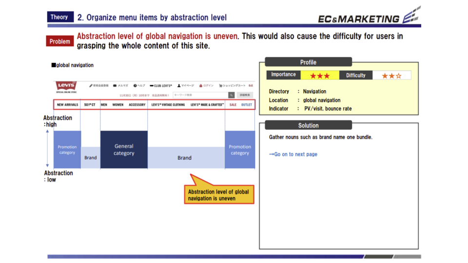
・グローバルナビゲーションに商品カテゴリとブランドライン(501等)が同じ階層で並んでおり、構造の不自然さにユーザーが混乱する。
・トップページのメインビジュアルが大きすぎるため、よく見られる「ランキング」などの重要コンテンツがファーストビューから見切れている。
・商品名が似ているアイテムが一覧に並んだ際、商品の違いがわかりにくく、詳細ページへ遷移しないと比較検討ができない。
★★★同様の課題に関する意見を聞きたい
—————————————————-
For the PC site as well, we ran behavior observation and interviews with five male and female monitors.
Here we found many issues: the wide screen real estate unique to PC was underused, and visual flow guidance was lacking. The global navigation structure didn’t match users’ mental models, frequently confusing them at the very entry point of the product search. On top of the same “CLUB LEVI’S” drop-off point seen on mobile, the lack of model body-type information and customer reviews left users unsure whether items would fit—visibly causing them to hesitate before buying.
■Notable issues
・Product categories and brand lines (such as 501) sat at the same level in the global navigation, and the unnatural structure confused users.
・The homepage main visual was so large that popular, important content like the rankings was pushed below the fold.
・When similarly named items appeared together in a list, the differences were unclear, forcing users to open detail pages just to compare.
被験者テスト(PC)1
被験者テスト(PC)2
被験者テスト(PC)3
被験者テスト(PC)4
ファッションに限らず、あらゆるブランド公式ECサイトは、卸先の小売店や楽天・Amazon・ZOZOTOWNなどのECモールといった「取引先」が同時に「強力な競合」にもなるという宿命的な市場で戦っています。価格や配送スピード、ポイント還元といった機能的価値において、巨大プラットフォームに対抗することは容易ではありません。
今回のプロジェクトは、グローバルでのサイトリニューアルを前に現状のUI/UX課題と改善案を洗い出し、コンバージョン率(CVR)を改善することが主目的でした。しかし、最も大きな収穫は、定性・定量の両面からアプローチし、特に「被験者テスト(行動観察調査)」を通じてユーザーのリアルな心理と行動を深く理解できたことにあります。
ユーザーは単にサイト内を回遊するだけでなく、常に他社サイトやECモールと行き来しながら比較行動を行っています。その際、ユーザーが購入を決定する重要な軸は「自分に合うサイズ感か」「着用イメージが湧くか」という点でした。ベンチマーク調査やテストで指摘された「スタッフやユーザーの着用レビューの充実」「モデルの体型情報の明記」といった改善案は、まさにこの不安を解消するためのものです。
公式サイトで購入してもらうためには、モールにはない「ブランド直営ならではの安心感と体験」を提供する必要があります。商品の背景にあるストーリーを的確に伝え、ストレスのないナビゲーションで目的の商品へ導き、サイズへの不安を取り除く。これらを徹底することが、結果として「公式サイトで買うベネフィット」の形成につながります。
本プロジェクトの重要性は、表面的なデザインの修正にとどまらず、データとリアルなユーザー行動に裏打ちされた「顧客視点の購入体験」を再構築した点にあります。ここで得られたサイト外での比較行動や購入検討軸に関する知見は、サイトリニューアルを成功に導くだけでなく、今後のブランドマーケティング全体において極めて有益な資産となるはずです。あらゆるメーカーやブランドのEC担当者にとって、顧客の真のニーズに向き合い、公式サイト独自の価値を高めるためのモデルケースと言えます。
★★★類似する課題のアドバイスをもらいたい
—————————————–
Not just in fashion, every brand-owned EC site competes in an inescapable market where its own “business partners”—wholesale retailers and marketplaces like Rakuten, Amazon, and ZOZOTOWN—are simultaneously powerful competitors. Matching these giant platforms on functional value such as price, delivery speed, and points rewards is no easy task. The primary goal of this project was to surface the current UI/UX issues and improvement ideas ahead of the global renewal and to raise the conversion rate (CVR). The greatest gain, however, was the deep understanding of users’ real psychology and behavior we achieved through both qualitative and quantitative approaches—above all, the user testing (behavior observation study).
Users don’t simply browse within one site; they constantly move back and forth between competitors and marketplaces, comparing as they go. In doing so, the decisive axes for purchase were “Will it fit me?” and “Can I picture myself wearing it?” The improvement ideas raised in benchmarking and testing—richer staff and customer wear-it reviews, and clearly stated model body-type information—are aimed precisely at dispelling that anxiety.
To win the purchase on the official site, the brand must offer the reassurance and experience that only a direct-to-consumer store can provide—something the marketplaces lack. Convey the story behind each product accurately, guide shoppers to their target item through frictionless navigation, and remove sizing anxiety. Doing these consistently is what ultimately builds the “benefit of buying on the official site.”
The significance of this project lies not in surface-level design fixes, but in rebuilding a “customer-centric purchase experience” grounded in data and real user behavior. The insights gained here—on off-site comparison behavior and the criteria customers weigh—will not only steer the renewal to success but should become a highly valuable asset for the brand’s marketing as a whole. For EC managers at any manufacturer or brand, it stands as a model case for confronting customers’ true needs and elevating the distinctive value of the official site.
Related Works
様々な課題解決事例・制作実績を掲載しています。
業界や商材が異なっても構造が近いケースは多くあります。
「自社の場合、どのように解決できるか聞きたい」
「予算内でどんなことができるか知りたい」
という方はお気軽にお問い合わせください。
貴社サイトの状況や課題感にあわせて近い成功例や改善の方向性をご案内します。
Consulting Specialist